Dining Room Colour Trends: Which Shades to Choose in 2026
What if the dining room became the most expressive room in the home in 2026? Long confined to restrained tones, it is now asserting itself as a true playground for colour. Preferences are evolving and so are the ways we use the space. We dine there, work there and entertain guests. So which trending colours for a dining room in 2026 truly help create a modern, warm and lasting atmosphere, without risking a design misstep?
Trending Colours for a Modern Dining Room
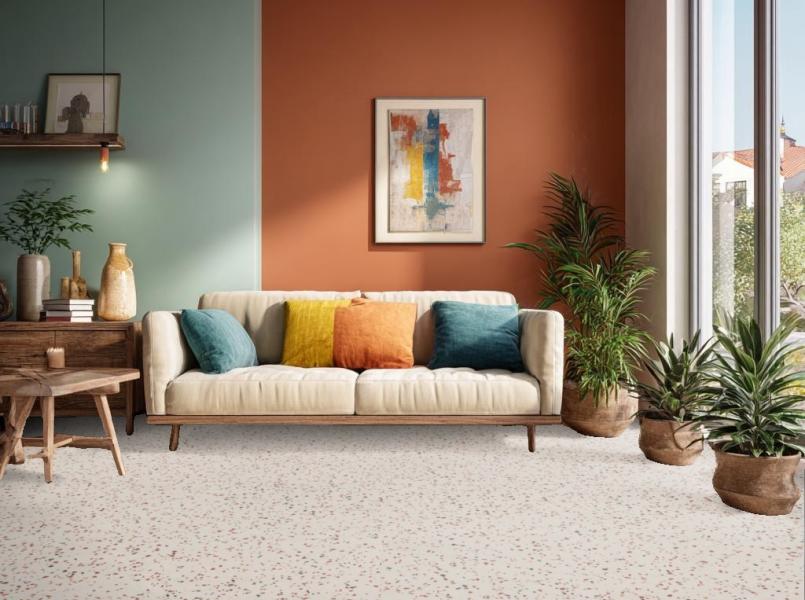
Modern interiors are moving away from cold minimalism. Greys are becoming warmer, beiges are gaining depth and muted greens and soft blues are replacing overly neutral tones. These colours create a contemporary yet lively dining room, where clean lines no longer feel austere.
A modern dining room colour works particularly well when paired with matte materials, light wood or mineral finishes. The space feels structured, but never rigid.
Trending Colours for a Welcoming Dining Room
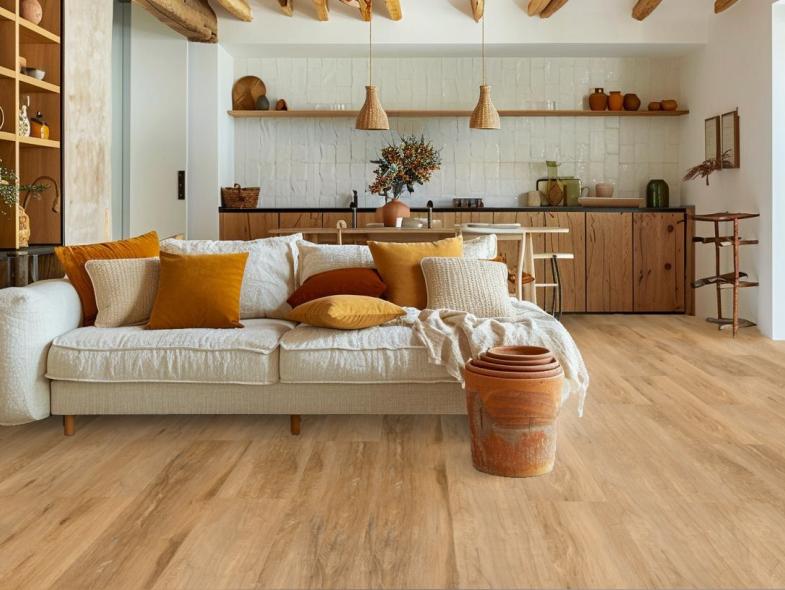
A welcoming atmosphere starts with visual warmth. In 2026, terracotta, soft ochre, light brown and clay pink are becoming safe and popular choices. They create a cosy ambiance that encourages long meals and spontaneous conversations.
These shades also offer a practical advantage: they hide everyday imperfections more easily. When choosing a trendy dining room paint colour, they provide a reassuring option, especially for a room that is frequently used.
Trending Colours for an Elegant Dining Room
Bottle green, midnight blue, deep chocolate or muted burgundy instantly add character to a space. These colours work particularly well in dining rooms where the furniture remains simple and understated.
The key is not to darken everything. A dark colour reveals its full potential when paired with lighter elements, a bright floor or subtle metallic accents.
Trending Colours to Refresh a Dining Room Without Renovating Everything
Use colour to transform the atmosphere without undertaking major renovations. An accent wall, an enveloping shade around the dining area or a stronger colour behind a sideboard can be enough to change the perception of the space.
This is often the ideal solution for refreshing your living or dining room without disrupting the overall balance of the space, especially in open-plan interiors.
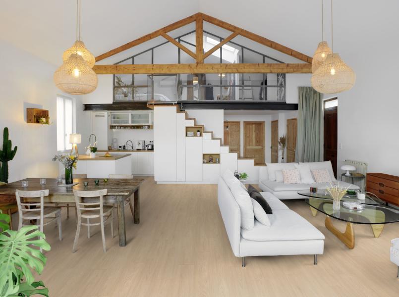
Trending Colour for a Living–Dining Room: How to Create Harmony
When the living room and dining room share the same space, colour becomes a real interior design tool. In 2026, the goal is no longer to make everything uniform, but to create a smooth visual continuity that structures the different uses of the space without dividing it.
Unifying Spaces with a Cohesive Palette
The key to successful harmony lies in a restrained palette. Two to three shades are more than enough to bring rhythm to an open space. A dominant colour is usually chosen first, often soft and enveloping, then one or two complementary tones are added to anchor each area.
This approach maintains strong visual consistency while avoiding a “catalog-style” look. A trendy dining room wall colour can subtly echo elements in the living room, through a wall, a rug or a decorative piece.
Creating Visual Breaks Without Dividing the Space
In an open living–dining area, colour helps define the different uses of the space without building walls. In 2026, this approach relies on clear but harmonious visual breaks, achieved through carefully chosen shades and well-defined zones.
For example, a living room styled in warm beige or luminous greige can lead into a dining area structured by a deep olive green or a rich blue-grey, applied only to the wall surrounding the dining table. The colour highlights the dining function while staying within the same chromatic family as the living room. The eye immediately understands the separation, without any feeling of compartmentalisation.
Transitional colours play a key role here, acting as a link between the two spaces. This can be achieved through:
- a shared wall painted in an intermediate shade, such as a greyed linen tone between a light living room and a darker dining area,
- a coloured wainscoting that visually continues from one space to another,
- or a continuous floor that ensures overall cohesion.
The floor itself reinforces this visual reading. A light wood-effect or soft concrete floor, used throughout both the living room and dining area, stabilises the entire space and allows for bolder wall colours without disrupting the balance of the room. Conversely, in a very bright interior, a slightly darker floor can serve as a neutral base that helps the wall colours interact harmoniously.
This approach works particularly well in multifunctional living spaces, where each area needs to stand out visually while remaining connected to the others.
Light or Dark Flooring Depending on Wall Colours
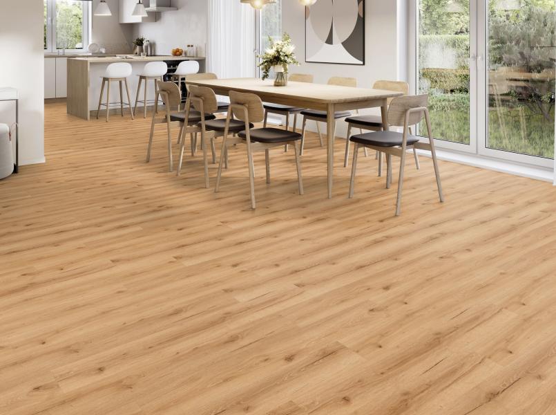
Light floors will continue to hold a strong place in 2026, especially when paired with coloured or darker walls. A light beige, sand or natural wood floor visually balances deep green, midnight blue, or warm brown walls. The room feels open and breathable, even with a bold colour palette.
Conversely, darker flooring makes perfect sense in a dining room with light or subtly tinted walls. A warm brown or softened anthracite grey floor anchors the dining area and reinforces a sense of stability. This contrast often creates a more sophisticated look, provided there is sufficient natural light.
Wood, Concrete, or Stone Effects: Which Trends Are Leading
Decor inspired by natural materials will dominate 2026 trends. Wood-effect flooring remains a must-have but is evolving toward more authentic shades: light oak, whitewashed wood, honey tones or slightly smoked finishes. These floors instantly bring warmth, regardless of the wall colour.
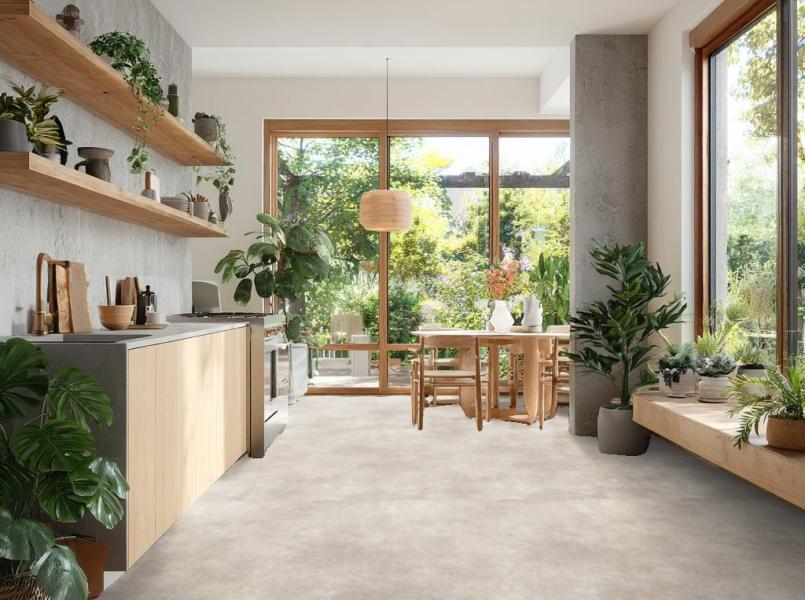
Concrete-effect flooring appeals to contemporary interiors. Softer than before, it now comes in light greys, greige or mineral tones, perfect for pairing with natural or deep wall colours. As for stone-effect flooring, it stands out in elegant dining rooms, where it enhances character without making the space feel heavy.
Examples of Wall and Floor Combinations That Work Over Time
Some combinations remain timeless because they rely on a simple balance:
- olive green or sage walls with light wood flooring for a natural and calming atmosphere,
- sand beige or greyed linen walls with light concrete-effect flooring for a contemporary and bright look,
- deep blue or chocolate brown walls with light stone flooring for an elegant and distinctive dining room.
In each case, the floor stabilises the space while the wall colour adds character. This approach helps create a dining room that feels current, but above all comfortable to live in over the long term.
Easy-Living Floors for an Everyday Dining Room
Long meals, chairs being moved, small everyday accidents… the dining room remains a highly used space. The flooring must keep up with the pace of daily life without becoming a constraint. Surfaces that are easy to clean and resistant to stains and light impacts naturally stand out.
Wood, stone, or concrete-effect designs perfectly suit this type of use. They add character without requiring complex maintenance. This type of flooring also makes it easier to choose a trendy dining room wall colour while maintaining a balanced and lasting visual harmony.
Gerflor Solutions to Combine Design, Durability and Easy Installation
At Gerflor, we design floors made for interiors that are truly lived in. Decorative vinyl flooring offers a wide range of styles, from warm light wood to elegant stone, while remaining comfortable and durable for everyday life.
Their easy installation allows you to transform a dining room quickly, without undertaking major renovations. It’s an ideal solution for refreshing a dining area, harmonising an open living–dining space, or complementing a new wall colour with confidence.
Choose your design, order a sample and imagine your future interior with confidence.